A Logit Model Introduction
Author: James Fogarty
First Release: 30 March 2018
A.1 Before you get started
Most of the steps involved in analysis of zere one type data for typical NRM type examples are fully explained in this guide. However, the explanations assume some familiarity with the R platform for statistics. If you are completely unfamiliar with R and the R Studio interface you are advised to consult the Introduction to R guides and the other support material before attempting the material below.
A.2 Background to logistic regression
A.2.1 Introduction
Logistic regression is a tool for analysing data where there is a categorical response variable with two levels. Examples of a dependent variable with two levels include data where we might have values reported as: dead or alive, germinate or did not germinate; or yes I am willing to pay that amount or no I am not willing to pay that amount.
Logistic regression is a type of model known as a generalized linear model (GLM). This type of model is used for response variables where regular linear regression does not work well. In particular, the response variable in these settings often takes a form where residuals look completely different from the normal distribution. With data that we typically code as one for yes' and zero forno’ the errors will be either one or zero; hence the error distribution can never approximate a normal distribution.
GLMs can be thought of as a two-stage modeling approach. The first step is to specify a probability distribution for the response variable based on our understanding of what we are measuring. When we have zero one data we use the binomial distribution. When we have count data such as the number of trips to a park that can only take positive integers we use the Poisson distribution. The second step is to model the parameter of the distribution using explanatory variables.
The outcome variable for a GLM is denoted by \(Y_i\), where the index \(i\) is used to represent observation \(i\). In a contingent valuation surevy, \(Y_i\) is used to represent whether respondent \(i\) answered the willing-to-pay yes (\(Y_i=1\)) or no (\(Y_i=0\)).
A general notation for the explanatory variables is to use: \(x_{1,i}\) to represent the value of variable 1 for observation \(i\), (in practice \(x_{1,i}\) could represent the age of respondent \(i\)) \(x_{2,i}\) is the value of variable 2 for observation \(i\), and so on. The actual \(x_{j}\) can be continuous variables or factor variables.
A.2.2 A linear model when \(y_{i}\) is dichotomous
Suppose \(y_{i}\) is coded 0 or 1, representing answers to a Yes or No question such as are you willing to pay a certain amount to ensure a wetland is restored, and let the answer yes or no be explained by one continuous variable, say the cost of a restoration project. If we plot this data we have the following plot.
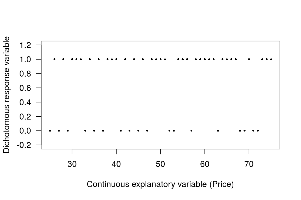
Figure A.1: Plot with zero one response variable and continuous predictor
Now suppose you fit a linear regression trend line for a straight line through that distribution of observations. Such a model is called a linear probability model. To fit such a model we use the traditional linear regression model of the form.
\[\begin{equation} y_{i}=b_{0}+b_{1}x_{i}+e_{i}\label{ols1} \end{equation}\]
Note that if \(E(e_{i})=0\), then the predicted value \(\hat{y_{i}}\) can be thought of as the probability of \(y_{i}=1\). If we fit this type of model to the data we have a plot like the following.
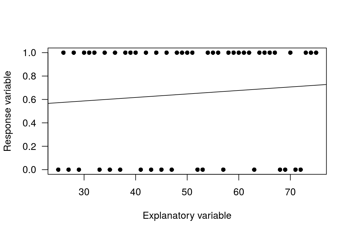
Figure A.2: Linear probability model
More generally, as long as \(b_{1}\ne0\), the line representing the predicted values will go above 1 and below 0 at some point. That the model predicts out of the [0,1] range is an issue. Even if we classify predictions in the negative as predicting 0, and predictions above 1 as equal to 1, this is a bit unsatisfactory. There is also no theory model to support such a kinked estimation function. If we construct a more extreme example it will be possible to see that the model predicts outside the [0,1] bound.
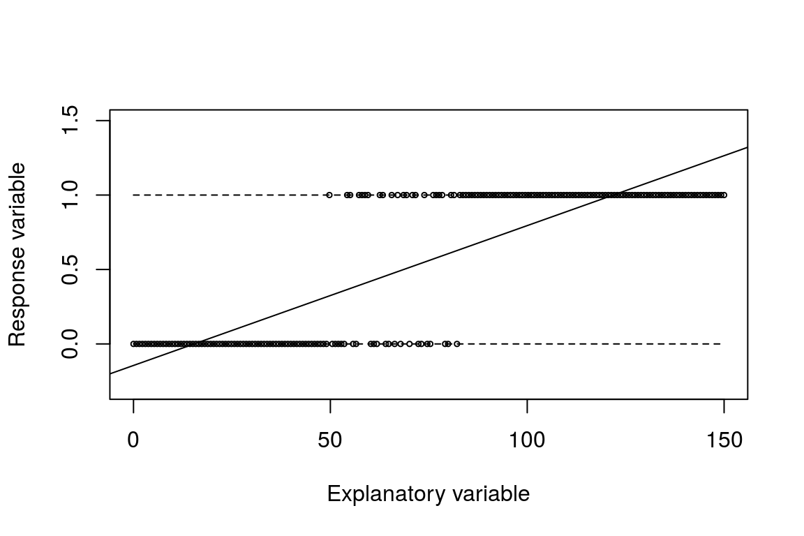
Figure A.3: OLS predicts out of the 0,1 range
Heteroskedasticity is also an issue with the linear probability model, although we can use `robust’ standard errors for inference we can do better than just use recourse to robust standard errors. To see the heteroskedasticity issue, consider the following. If \(y_{i}=1\), the error term must be \(1-P_{i}\).
\[\begin{equation} \begin{array}{l} y_{i} = P_{i} + e_{i}\\ y_{i} - e_{i}=P_{i} \\ 1 - e_{i}=P_{i} \\ e_{i} =1 - P_{i} \end{array} \end{equation}\]
Similarly, if \(y_{i}=0\), that must mean the error term is \(-P_{i}\): \[\begin{equation} \begin{array}{l} y_{i} = P_{i} + e_{i}\\ y_{i} - e_{i}=P_{i} \\ 0 - P_{i} = e_{i}\\ e_{i} = -P_{i} = \end{array} \end{equation}\]
So for a given value of X, the error term can take on only two values. This in turn means that it is not possible for the distribution, conditional on X, to be approximately normal.
With a bit of work, it can also be seen that the variance of the error term depends on X: \[\begin{equation} \begin{array}{l} Var[e_{i}]= E(e_{i}^{2})=(1-\beta_{0}-\beta_{1}X_{i})^{2}P_{i}+ (0-\beta_{0}-\beta_{1}X_{i})^{2}(1-P_{i})\\ Var[e_{i}]= (1-\beta_{0}-\beta_{1}X_{i})(1-\beta_{0}-\beta_{1}X_{i})P_{i}+ (-\beta_{0}-\beta_{1}X_{i})(-\beta_{0}-\beta_{1}X_{i})(1-P_{i})\\ Var[e_{i}]= (1-P_{i})(1-P_{i})P_{i}+ (-P_{i})(-P_{i})(1-P_{i})\\ Var[e_{i}]= (P_{i})(1-P_{i}) \\ Var[e_{i}]= (\beta_{0}+\beta_{1}X_{i})(1-\beta_{0}-\beta_{1}X_{i})^{2}(1-P_{i})\\ \end{array} \end{equation}\]
As such, the variance of the error term depends on \(X_{i}\), and there is by definition heteroskedasticity. This can be addressed via robust methods, but there is a better approach.
A.2.3 Motivation for the dependent variable: option 1
With zero and one data the dependent variable is not continuous. With the standard linear model, technically we assume that the dependent variable can run from \(-\infty\) to \(\infty\). In practice there is quite a bit of flexibility with this assumption. For example, measurements on tree width or other physical objects can not be negative but we can still use the standard linear model. Data that can take only the value zero or one, on the other hand, does not really fit with the model.
Probabilities are always in the [0,1] range, so let us say that we model the response variable, which is something like or or or , where we have coded the data as 1 = yes and 0 = no as a probability. If we think of modelling a probability, that means we are considering something that runs from zero to one, rather than something that takes the value zero or one. So we have moved from thinking about two points only to thinking about a continuous variable that runs from zero to one. But with this thinking we want something that runs from \(-\infty\) to \(\infty\).
The odds of an event are defined as: \(\frac{P}{1-P}\). So if the probability of an event is 0, then the odds of that event are: \[\begin{equation} \frac{0}{1-0}=0. \end{equation}\]
If the probability of an event is 1, then the odds of the event are: \[\begin{equation} \frac{1}{1-1}=\infty \end{equation}\]
So with odds, we have a measure that will run smoothly from \(0\) to \(\infty\). We can also look at some values in between these extremes to see what is happening.
If the probability of an event is 0.25, then the odds of the event are \(\frac{0.25}{1-0.25}=0.33\), and if the probability of an event is 0.75, then the odds of the event are \(\frac{0.75}{1-0.75}=3\), etc.
The final step is to note the properties of logs. For values less than one, the log of the number is negative, and as the number approaches zero, the log of the number tends to \(-\infty\). The log of infinity, on the other hand, is still infinity. So what does all this mean. If we think of modeling \(log\left(\frac{P}{1-P}\right)\) we then have something that runs from \(-\infty\) to \(\infty\) on the right hand side of our model as the dependent variable. This then has the properties we want for modelling.
A.2.4 Motivation for the dependent variable: option 2
Suppose that the probability that \(y_{i}=1\) changes in response to changes in \(x_{i}\). So in a regression modelling context we are saying that \(x_{i}\) can explain the probability that \(y_{i}=1\). Further, note that as we have a probability, we need to constrain this smoothly changing function to stay within the [0,1] bound. This requirement implies that the relationship between \(x_{i}\) and \(Prob(y_{i}=1)\) should follow an S-shape. There are a number of function that generate an S-shape. One option that smart people have worked out that delivers an S-shaped curve is:
\[\begin{equation} Prob(y_{i}=1)=\frac{exp(b_{0}+b_{1}x_{i})}{1+exp(b_{0}+b_{1}x_{i})}=\frac{1}{1+exp(-1*(b_{0}+b_{1}x_{i}))}=\frac{1}{1+e^{-(b_{0}+b_{1}x_{i})}} \end{equation}\]
This transformation of \(x_{i}\) gives back a very small value if \(x_{i}\) is really small, and it gives back a value that is close to 1 if \(x_{i}\) is really big. For our purposes this seems an ideal function as it will keep the transformed values (which will be our predicted probablities) between zero and one. To see how the curve works let us consider some specific curves to see what happens with different values for \(b_{0}\) and \(b_{1}\). The the example curves drawn are for the following values:
- \(b_{0}\) = -10 and \(b_{1}\) = 0.1
- \(b_{0}\) = -10 and \(b_{1}\) = 0.2
- \(b_{0}\) = -20 and \(b_{1}\) = 0.2
- \(b_{0}\) = -20 and \(b_{1}\) = 0.8
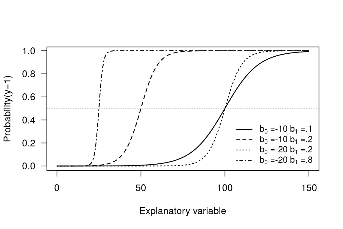
Figure A.4: S-shapped curve options
From the plot the way the \(b_{0}\) and \(b_{1}\) parameters control the shape of the curve can be seen. By varying the \(b_{0}\) we can slide a given S-shaped curve along the horizontal axis, and by varying \(b_{1}\) parameter we can change the shape of the S-curve.
Also note that when \(x\) is equal to \(-b_{0}/b_{1}\), then \(b_{0} + b_{1}x = 0\), and hence: \[\frac{exp(b_{0}+b_{1}\cdot x)}{1+exp(b_{0}+b_{1}\cdot x)}=\frac{exp(0)}{1+exp(0)}=\frac{1}{1+1}=0.5\]
So the ratio \(-b_{0}/b_{1}\) defines the point where the predicted probability is 0.5. This is a useful property for us to note.
If we think of the slope of the curve, it defines the change in probability associated with a one unit increase in \(x_{i}\) and if you work through the steps the expresion for the slope is \(b_{1}\cdot P_{i}\cdot(1-P_{i})\). Specifically, this says that the effect of a unit change in \(x_{i}\) depends on the probability. If \(y_{i}\) is very likely to be a 1 or a 0, a change in \(x_{i}\) doesn’t make much difference. If we think about a non-maket valuation problem, if the price is already very high such that the probability a respondent will say no I am not willing to pay this amount, then increasing the bid amount by an extra dollar is not going to have much impact.
Also note from the formula that slope will be at it steepest when \(P_{i}=0.5\). This says that around the tipping point from switching from saying yes to no is where changes in the explanatory variable have the most impact. Again this seems a reasonable property.
A.2.5 Optional technical notes on estimation
The parameters \(b_{0}\) and \(b_{1}\) are estimated via the method of maximum likelihood.
The question is what is the likelihood that we would observe a given sample of 0’s and 1’s? To solve this we put the observations with 0’s first and then the 1’s. We then assume that the observations are statistically independent. This means that the probability of the sample equals the individual probabilities multiplied together. Hence,
\[\begin{eqnarray} Likelihood\, of\, Sample=P(y_{1}=0,y_{2}=0,...,y_{m}=0,y_{m+1}=1,y_{m+2}=1,...,y_{N}=1)\\ =P(y_{1}=0)P(y_{2}=0)\cdots P(y_{m}=0)P(y_{m+1}=1)P(y_{m+2}=1)\cdots P(y_{N}=1) \end{eqnarray}\]
This expression is the likelihood function, which is typically denoted L, and since the probabilities depend on parameters \(b_{0}\) and \(b_{1}\) , the function can be written: \(L(b_{0},b_{1})\).
Remembering that the probability that \(y_{i}=0\) is \(1\) minus the probability that \(y_{i}=1\), we can write \[\begin{eqnarray} L(b_{0},b_{1})=(1-P(y_{1}=1))(1-P(y_{2}=1))\cdots(1-P(y_{m}=1))\nonumber \\ \times P(y_{m+1}=1)P(y_{m+2}=1)\cdots P(y_{N}=1) \end{eqnarray}\]
This notation can be made more compact by writing \(P_{i}\) rather than writing down the \(P(y_{i}=1)\) over and over again.
The Likelihood function is a complicated formula because it is composed of numbers that are multiplied together. In contrast, if we work with logarithms the product is converted to a sum. It is mathematically identical to maximize \(L\) or the log of \(L\), and when the formula is additive rather than multiplicative it is much easier to work with.
\[\begin{equation} \ln L(b_{0},b_{1})=\ln(1-P_{1})+\ln(1-P_{2})+\cdots+\ln(1-P_{m})+\ln(P_{m+1})+\cdots+\ln(P_{N}) \end{equation}\]
The MLE is the choice of estimators \(b_{0}\) and \(b_{1}\) that maximizes the log of the likelihood function, which necessarily also maximises the likelihood.
A.3 Worked example of a logit model
This is an example the works you through the mechanics of modelling zero one data in general. The context is transport decisions: a key area for NRM policy work. As a first step we load the data and check that it has been read in correctly.
T <- data.frame(AUTOtime = c(52.9, 4.1, 4.1, 56.2, 51.8, 0.2, 27.6,
    89.9, 41.5, 95, 99.1, 18.5, 82, 8.6, 22.5, 51.4, 81, 51, 62.2,
    95.1, 41.6), BUStime = c(4.4, 28.5, 86.9, 31.6, 20.2, 91.2, 79.7,
    2.2, 24.5, 43.5, 8.4, 84, 38, 1.6, 74.1, 83.8, 19.2, 85, 90.1,
    22.2, 91.5), Dtime = c(-48.5, 24.4, 82.8, -24.6, -31.6, 91, 52.1,
    -87.7, -17, -51.5, -90.7, 65.5, -44, -7, 51.6, 32.4, -61.8, 34,
    27.9, -72.9, 49.9), Auto = c(0, 0, 1, 0, 0, 1, 1, 0, 0, 0, 0,
    1, 1, 0, 1, 1, 0, 1, 1, 0, 1))
head(T, n = 3)  # Display the first three rows of data
## AUTOtime BUStime Dtime Auto
## 1 52.9 4.4 -48.5 0
## 2 4.1 28.5 24.4 0
## 3 4.1 86.9 82.8 1A.3.1 Data description
This is a [0,1] model. In the data set:
- Autotime = the time taken to get to work by car, in minutes
- Bustime = the time taken to get to work by bus, in minutes
- Dtime = the difference between the travel time on each method for each individual
- Auto = the value one if the person travelled by car and zero if the person travelled by bus.
Note that you need to think carefully about the data set up here.
For the first row in the data set we have: Dtime = -48.5. This means it is 48.5 mins faster to travel by bus than car. Now look at the Auto column. It shows a zero, so this person took the bus.
For the third row three in the data set we have Dtime = 82.8 so it is 82.8 mins faster to travel by car than bus. If we look atthe Auto column it tells us that the person took the car.
By creating the Dtime variable we have a relative measure that is then easy to plot on one axis. As a first step, let’s look at the data with a quick plot. You need to make a judgement about how much time you spend plotting based on whether the plot is to help you just look at the data or you want to use the plot in a report. For a fancy plot for a research report we might use the following setup.
with(T, plot(Auto ~ Dtime, pch = 19, xlim = c(-110, 110), ylim = c(-0.2,
    1.2), xlab = "Difference in travel time between Car and Bus",
    ylab = "Drive = 1 Bus = 0"))
title(main = " Travel decision", cex.main = 0.9, font.main = 4)
abline(v = 0, col = "grey")
abline(h = -0.01, lty = 2, col = "grey")
abline(h = 1.01, lty = 2, col = "grey")
text(-45, -0.18, "The bus is quicker on this side", cex = 0.8)
text(45, 1.15, "The car is quicker on this side", cex = 0.8)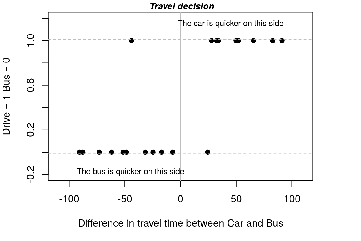
Figure A.5: A detailed plot of the data
We learn a lot about what is going on by just looking at the data and this representation show that: (i) in 10 out of 11 cases, if it is quicker to get to work by bus, people choose the bus; and (ii) in 9 out of 10 cases, if it is quicker to get to work by car, people choose the car.
This seems to make sense. If a plot does not make sense we might have read the data incorrectly.
A.3.2 The linear probablity model
To start our analysis, let’s estimate a `linear probability model’. Note we actually know that in this instance the errors are heteroskedastic, however: (i) as a formal test will fail to pick this up, and (ii) because correcting for hetero does not resolve the main problem with the model, ie that it predicts outside the [0,1] range we will not consider the issue here.
We estimate the linear probability model and get the summary outpur as follows:
##
## Call:
## lm.default(formula = Auto ~ Dtime, data = T)
##
## Residuals:
##     Min      1Q  Median      3Q     Max
## -0.6564 -0.1438  0.0278  0.1529  0.8246
##
## Coefficients:
##             Estimate Std. Error t value Pr(>|t|)
## (Intercept)  0.48480    0.07145    6.79  1.8e-06 ***
## Dtime        0.00703    0.00129    5.47  2.8e-05 ***
## ---
## Signif. codes:  0 '***' 0.001 '**' 0.01 '*' 0.05 '.' 0.1 ' ' 1
##
## Residual standard error: 0.327 on 19 degrees of freedom
## Multiple R-squared:  0.611,  Adjusted R-squared:  0.591
## F-statistic: 29.9 on 1 and 19 DF,  p-value: 2.83e-05
From the summary output we can say: (i) The difference in time is statistically significant and (ii) For every minute extra it takes to get to work traveling by bus, relative to travelling by car the probability of selecting a car to travel increases by 0.007.
To see what is going on with the model we can add the predicted values to our plot. Note that before creating the plot I checked the max and min for the value on the horizontal axis. To add the predicted values to my existing plot, I then just use the lines function.
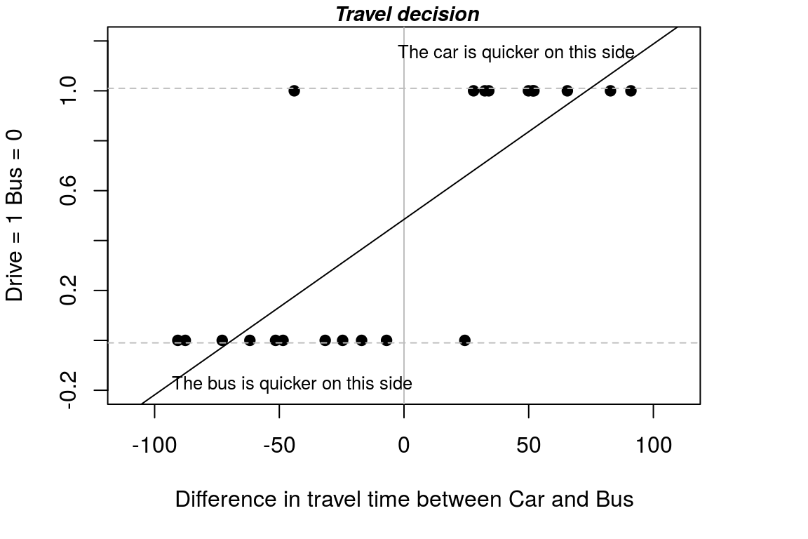
Figure A.6: A detailed plot of the data
Can you see what the problem with the linear probability model is?
We can check whether we will have any values outside the [0,1] range by checking the max & min travel time in our data set.
##       1
## 1.12462## 1
## -0.152916From checking the max and min values for the data we can see that yes, we will have values outside the [0,1] range and hence, we have values that do not make sense.
Note that we have defined traveling by car as = 1 and travelling by bus as = 0. That means the predicted probabilities for each individual are the probability of travelling by car.
We are interested in predicting the probability that someone will travel by car. The predicted probabilities for each person can be obtained as:
##    predict.lm1.
## 1      0.143792
## 2      0.656351
## 3      1.066961
## 4      0.311833
## 5      0.262616
## 6      1.124615
## 7      0.851110
## 8     -0.131823
## 9      0.365268
## 10     0.122699
As expected we have values outside the [0,1] range.
To get some idea of how well our linear model explains choices we can classify choices we can ingore the fact that some of the values are outside the plausible range and simply say that if the predicted probability is greater than 0.5 we predict they will travel by car and if it is less than 0.5 they travel by bus. We can then put together this information into a table as follows.
PredProb.lm <- ifelse(PredProb >=0.5 , "car", "bus")
ActualTravel <- ifelse(T[,4] == 1 , "car", "bus")
table(ActualTravel, PredProb.lm)
## PredProb.lm
## ActualTravel bus car
## bus 10 1
## car 1 9In the summary table the on-diagonal bus-bus and car-car combinations are correct matches. So, the model gets 19 out of 21 (90 percent) of the predictions for travel correct. Not too bad, for a model that is flawed!
A.3.3 The logit model: basic implementation
Let us now consider a model that allows us to resolve the problem of values outside the [0,1] interval. There are a range of model options that can be considered, but here we focus on the logit model. The logit model has the advantage that there are many extensions to the basic model that allow very complex scenarios to be considered. The logit is also most common in the transport literature, which is what this example considers.
Recall the linear probability model.
The problem with the model is that the marginal response to an increase in the relative travel time of the bus was constant so we could break the [0,1] range. If, instead of a linear model, we fit a sigmoid shape (S-shape) to the data we can stay within the [0,1] range for predicted probabilities.
A sigmoid shape means that the marginal response to an increase in relative travel time is not constant. For example, when the bus is already 90 minutes slower than a car the marginal effect of an extra minute is low. This makes sense. When the car already has a significant advantage over the bus an extra minute is likely to have little effect.
The maximum marginal effect is when the difference between the travel options is low. This also makes sense. The points around where it becomes quicker to travel by car, relative to a bus, are likely to be points where you are thinking about the relative time difference.
The form we use to specify the model is very similar to the linear probablity model, except that rather than the lm() function we use the glm() function. Whereas the notation lm() was for linear model we have glm() for generalised linear model.
When using the glm options it is necessary to specify some additional information. You just need to add some additional information on the ‘family’ for the link function. Recall that for the logit model the dependent variable is log(P/1-P), and this expression is called a logit, and this is the term we specify in the extra part of the model formula.
Before we look at the model outputs, let’s plot the logit predicted values onto our existing plot.
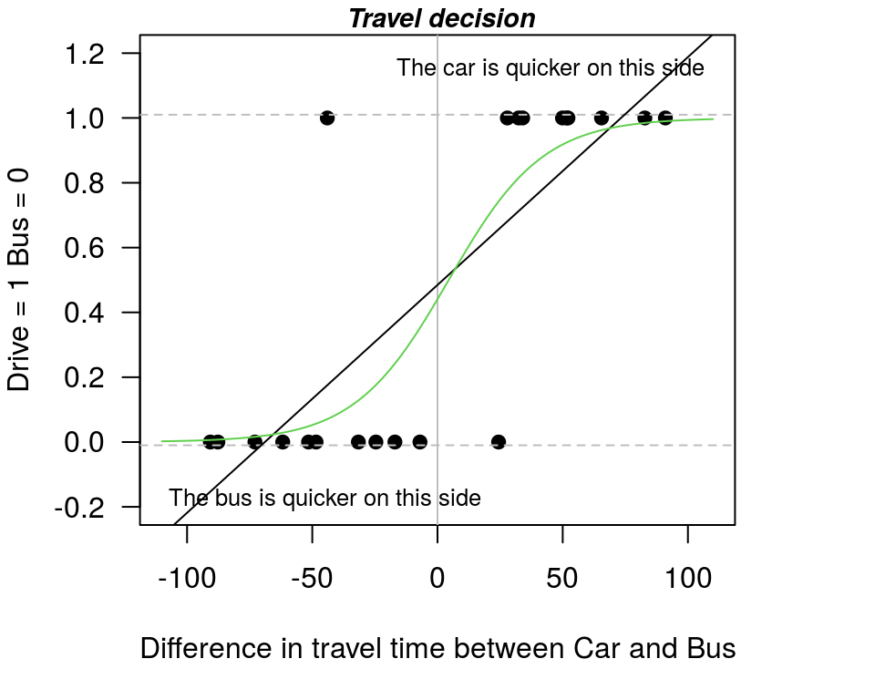
Figure A.7: The linear probability model v the logit model
preds <- predict(logit1,data.frame(Dtime=-110:110), type="response" )
lines(-110:110,preds,type=2) # dashed line
From this plot you can see that the logit model results in an S-shaped curve. We call the summary model output as before, where the main point to note in the summary is that coefficient on Dtime is statistically significant. So, the results tell us that the effect of relative travel time is statistically significant.
##
## Call:
## glm(formula = Auto ~ Dtime, family = binomial(link = "logit"),
##     data = T)
##
## Deviance Residuals:
##    Min      1Q  Median      3Q     Max
## -1.647  -0.341  -0.113   0.397   2.301
##
## Coefficients:
##             Estimate Std. Error z value Pr(>|z|)
## (Intercept)  -0.2376     0.7505   -0.32     0.75
## Dtime         0.0531     0.0206    2.57     0.01 *
## ---
## Signif. codes:  0 '***' 0.001 '**' 0.01 '*' 0.05 '.' 0.1 ' ' 1
##
## (Dispersion parameter for binomial family taken to be 1)
##
##     Null deviance: 29.065  on 20  degrees of freedom
## Residual deviance: 12.332  on 19  degrees of freedom
## AIC: 16.33
##
## Number of Fisher Scoring iterations: 6
Next we pull together the same predicted versus actual table that we have used previously, which again shows that we get 19 predictions correct and 2 wrong.
PredProbLogit <-  predict(logit1, type="response")  # actual predicted probabilities
PredProb.L <- ifelse(PredProbLogit >=0.5 , "car", "bus")
ActualTravel <- ifelse(T[,4] == 1 , "car", "bus")
table(ActualTravel, PredProb.L)
## PredProb.L
## ActualTravel bus car
## bus 10 1
## car 1 9A.3.4 Predicted values: log odd, odds, and probabilities
We now explore some questions of interest, and how to use the functions in R to answer these questions.
Q1. What is the predicted probability of driving when transport by car is:
- 30 mins quicker than the bus?
- 30 mins slower than the bus?
- the same as the bus?
If we just use the predict option, and specify the time we want to evaluate at we get values on a log odds scale. It is however hard to understand what values on a log odds scale mean.
predict(logit1,data.frame(Dtime=30) )
predict(logit1,data.frame(Dtime=-30))
predict(logit1,data.frame(Dtime=0))
## 1
## 1.35572## 1
## -1.83087## 1
## -0.237575If we undo the log transformation we get the values on the odds scale. Recall that for an odds scale, if the value is greater than one it means that the probability is greater than 0.5, and if the odds are less than 0.5 it means that the probability is less than 0.5.
exp(predict(logit1,data.frame(Dtime=30)))
exp(predict(logit1,data.frame(Dtime=-30)))
exp(predict(logit1,data.frame(Dtime=0)))
## 1
## 3.87955## 1
## 0.160274## 1
## 0.788537We can get the probabilities, which is what we generally want by uses the call to response as:
predict(logit1,data.frame(Dtime=30), type="response" )
predict(logit1,data.frame(Dtime=-30), type="response" )
predict(logit1,data.frame(Dtime=0), type="response" )
## 1
## 0.795063## 1
## 0.138135## 1
## 0.440884Note that if we have probabilities, we know that p/(1-p) = odds so we have:
predict(logit1, data.frame(Dtime = 30), type = "response")/(1 - predict(logit1,
    data.frame(Dtime = 30), type = "response"))
## 1
## 3.87955The interpretation of the Prob =0.44 value with zero time difference is that there is a slight preference for the bus when travel time is the same. To know that we need to know that the we have classified car = 1. As we apply a decision rule using 0.5, with P=0.44 we predict a zero value, which in practice means we pick bus, which is coded as zero.
A.3.5 Marginal effects
Q.2 What about the marginal effect of an extra minute waiting time?
Recall that the problem with the linear probability model was that for every extra minute of travel time saved by a mode of transport the probability of choosing that method always increases by .007. So, when the car is 1 minute, 20 minutes, or 50 minutes faster than the bus, the marginal effect of an extra minute is to raise the probability of choosing to travel by car by .007.
Let us say we are interested in the marginal effect at the following times:
- Dtime= 1 = car is faster by 1 minute
- Dtime= 20 = car is faster by 20 minutes
- Dtime= 50 = car is faster by 50 minutes
- Dtime=-10 = bus is faster by 10 minutes.
A.3.5.1 The technially correct method to calculate marginal effects
To work out the marginal effects, if we do this the technically correct way it is hard work to answer this question. But for completeness, let’s apply the technically correct formulas.
b1 <- summary(logit1)$coefficients[1, 1] # grab the coefficient for the intercept
b2 <- summary(logit1)$coefficients[2, 1]  # grab the coefficient Dtime

(exp(-(b1+(b2*1)))/(1 +exp(-(b1+(b2*1))))^2)*b2  # effect at time = 1
(exp(-(b1+(b2*20)))/(1 +exp(-(b1+(b2*20))))^2)*b2   # effect at time = 20
(exp(-(b1+(b2*50)))/(1 +exp(-(b1+(b2*50))))^2)*b2   # effect at time = 50
(exp(-(b1+(b2*-10)))/(1 +exp(-(b1+(b2*-10))))^2)*b2   # effect at time = -10 (bus is faster)
## [1] 0.0131651## [1] 0.0112535## [1] 0.00398975## [1] 0.0114943So we see that the marginal effect changes depending on the relative time difference we consider. The marginal effect is much lower when the car is 50 mins faster than when it is only one minute faster. This is what we want as part of the model.
You can get some insight in to the shape of the marginal effect by calculating all the predicted probabilities, and then looking at the difference in the values between adjacent time periods. It is easiest to see this as a plot. Note that when either the bus or the car is already the quickest means of transport by a significant margin the marginal effect is low, and that the marginal effect peaks at the point when the two types of transport are equally in terms of time.
par(mfrow = c(1, 1), mar = c(5, 4, 1, 4))

PP <- predict(logit1, data.frame(Dtime = -100:100), type = "response")
Y <- diff(PP, lag = 1)  #  This uses the first difference in the series
X <- seq(from = -99, to = 100, by = 1)  # because i have differences i have lost one observation
plot(Y ~ X, typ = "l", main = "Marginal Effect Plot", xlab = "Relative time (mins)",
    ylab = "Marginal effect", las = 1)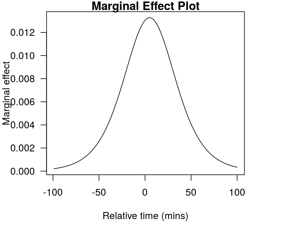
Figure A.8: The way the marginal effect changes with time
Note that if you know the formulas, you can also calculate predicted probabilities by hand. For example to calculate the predicted probability when the car is 30 mins quicker we have:
## [1] 0.795063A.3.5.2 A practical way to calculate marginal effects
A simpler way to calculate marginal effects is inspired by the above plot. Specifically we get the marginal effect by looking at the difference in the predicted probability just before and just after the Dtime value we want to consider. Note we need the difference to be one unit for this to work, so we go 0.5 either side of the value we want to evaluate for. So, if we are considering 1, 20, and 50 mins faster for the car as the evaluation points, we can do the calculation as:
predict(logit1,data.frame(Dtime=1.5), type="response" )
-predict(logit1,data.frame(Dtime=0.5), type="response" )

predict(logit1,data.frame(Dtime=20.5), type="response" )
-predict(logit1,data.frame(Dtime=19.5), type="response" )

predict(logit1,data.frame(Dtime=50.5), type="response" )
-predict(logit1,data.frame(Dtime=49.5), type="response" )
## 1
## 0.0131644## 1
## 0.0112531## 1
## 0.00399001As you can see, the marginal effect gets smaller and smaller as the advantage of the car increases. For a scenario where the the bus is quicker by 10 minutes we have:
predict(logit1, data.frame(Dtime = -9.5), type = "response") - predict(logit1,
    data.frame(Dtime = -10.5), type = "response")
## 1
## 0.0114939A.3.6 The 50 percent support point in logit models
The final thing we might want to know is at what point will 50 percent of the people (in the sample) choose to travel by car. The 50 percent support point is very important in NMV studies.
Given we have b1 for the intercept and b2 for Dtime we find the point that 50 percent of the population will choose to travel by car as: -intercept/slope, which is then:
## [1] 4.47329How do we interpret the value 4.47?
The values says that when travel time by car is 4.47 minutes faster than bus, 50 percent of our sample will choose to travel by car. As it corresponds to the point of ‘majority support’, the 50 percent point is important for public policy type questions. It is important to remember this ratio.
A.3.7 Adding estimate standard errors to the estimate
Rather than just report the value 4.47 minutes, we might want to place some uncertainty bounds around the estimate. We can do that using the delta method. This technique is available in the car package, which is loaded when you load the AER package.
library(AER)
deltaMethod(logit1, "-b0/b1" , vcov. = vcov(logit1), parameterNames= paste("b", 0:1, sep=""))
## Estimate SE 2.5 % 97.5 %
## -b0/b1 4.473 13.950 -22.869 31.82We see that this method gives us the same point estimate as we found above but also gives a standard error. The standard error is a measure of uncertainty. In our model we have 19 degrees of freedom. The critical t-value for 19 dof is 2.09. So if we look at 95% CI around our point estimate it is plus or minus 2.09 multiplied by 13.9. So there is actaully great uncertainty about this estimate.